
Back to Works
Visipal
Helping visually impaired children navigate the world with greater confidence.
VISIPAL
Making the internet readable for every child.


ROLES
Product Ideation
Research
Lead Product Designer
TIMELINE
~1 month
TOOLS
Figma
Context
Elementary and middle school increasingly runs through a browser — researching projects, exploring sites for virtual field trips, reading articles, collaborating on assignments. But almost none of that content is designed with children in mind. Students who are blind, low vision, colorblind, or sensitive to visual stimuli hit small fonts, low contrast, colour-coded information they can't decode, and auto-playing clutter. The result isn't only difficulty reading — it's children who feel discouraged, and dependent on someone else to get through their own homework.
The Ask
So, how might we empower visually impaired children to independently and confidently use the internet for learning?
/
The Curious Reader Held Back
ALEX, 8 — LOW VISION AND NYSTAGMUS, LOVES LEARNING ABOUT SNAKES
GOAL
To read and learn like the other kids — and to do it on his own, without having to ask.
NEEDS
Text he can actually see, broken into pieces he can hold, and vocabulary help the moment he needs it.
PAIN POINTS
Gray text on white is invisible, long paragraphs overwhelm, and zooming makes him lose his place — so he avoids reading and feels behind.
User Research
Alex isn't an edge case. We looked at how reading difficulty and colour vision deficiency actually play out in classrooms, and the pattern held across every source: the barrier presents as visual, but the damage lands on confidence.
10%
of children experience persistent reading difficulties despite adequate cognitive ability
78%
of colourblind students are often frustrated or confused by colours in school assignments
1 in 3
say colour blindness affected their confidence in school; 30% assumed they were slow learners
The gap was never comprehension. These are children who understand the material and simply can't reach it — which made this a problem of access and self-image at the same time.
Solution
VisiPal is a browser extension that turns any article into a personalised, accessible reading environment. A four-step onboarding lets a student describe their own barrier, then tunes typography, contrast, and learning support around it — and VisiPods gives them somewhere to share what they've read.
Onboarding starts with the reader
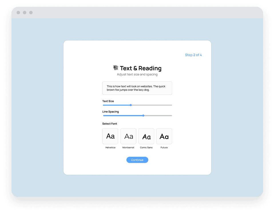
Students first identify their own reading challenges, then set font size, style and line spacing to match how they actually read.

Themes chosen for how you see
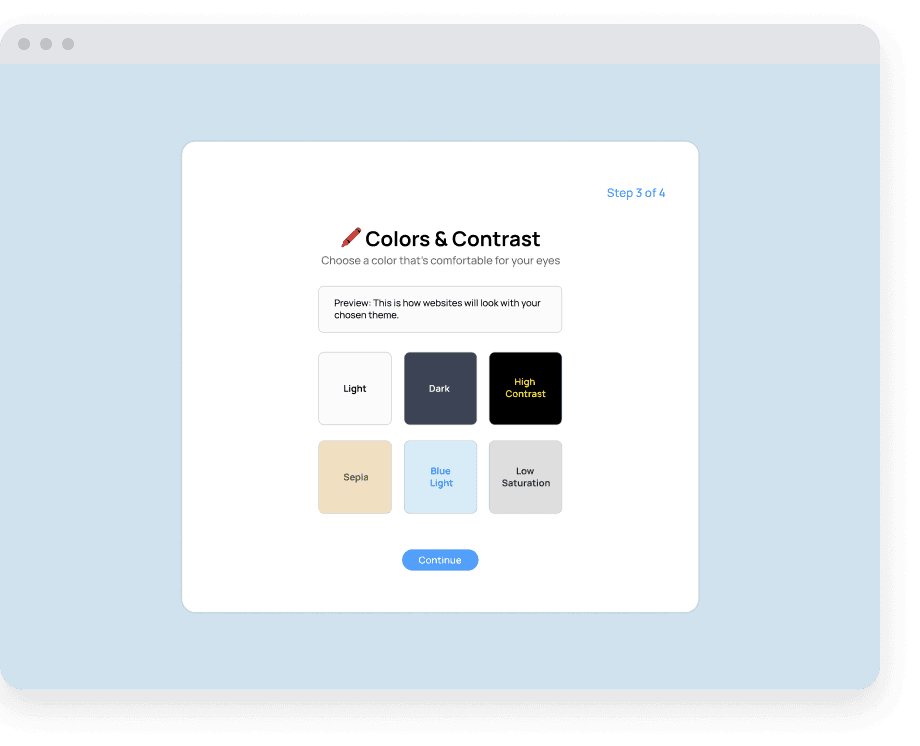
Scientifically proven colour combinations — high contrast for low vision, blue light for light sensitivity and digital eye strain.

Tools that sit inside the page
Bump text size up or down, open out the line spacing, and switch on a high-contrast theme — controls that live inside the page and reshape it around how each child reads best.


VisiPods keep reading social
A safe, teacher-monitored classroom where students share what they have read and react to each other’s discoveries.

01
Onboarding that starts with the child's own barrier
Step one asks what's actually hard — low vision, difficulty with colours, sensitivity to bright light or movement — so the same extension configures itself around very different needs instead of assuming one profile.
02
Text and reading controls
Font size, typeface, and line spacing adjust against a live preview, so a student can see the change on real text before committing to it.
03
Colours and contrast
Six research-backed themes, from high contrast for low vision through to blue light for light sensitivity and digital eye strain.
04
Learning tools
An AI summarizer condenses long articles, Focus Mode highlights one line at a time and hides ads and pop-ups, and Smart Definitions explains hard words in place at an age-appropriate level.
05
VisiPods
A safe, teacher-monitored classroom feed where students post what they've read and react to each other's discoveries — turning solitary reading into something shared.
Key Takeaways
The designathon brief was connection-centred design, and it turned out to be the right lens. The hardest part of Alex's day wasn't decoding a paragraph — it was doing it alone.
01
Accessibility is an emotional problem wearing a technical costume.
Alex's barriers were measurable — contrast, font weight, paragraph density — but the cost was confidence. He felt behind and ashamed, so independence had to be a design goal sitting alongside legibility.
02
Let the child name the barrier.
Rather than inferring a single accessibility profile, onboarding opens by asking what's hard. Low vision, colour difficulty, and light sensitivity need genuinely different defaults, and only the student knows which applies.
03
Access alone isn't connection.
Making the article readable solved the task; VisiPods solved the isolation. Sharing a cool fact with classmates is what made learning feel shared rather than remedial — and it's what the connection-centred brief was really asking for.

POWERED BY POKE BOWLS
&& MANGO JUICE